Elevation
Bike Ski Board
Brand Identity & Signage Design | Sun Peaks, BC
A fixture of the Sun Peaks mountain community, Elevation Bike Ski Board has grown into the resort's largest retail and rental operation, serving skiers, snowboarders, and mountain bikers year-round.
As the business expanded, its existing branding no longer reflected what Elevation had become. Badlands was brought on to develop a new visual identity that would capture the energy of the business, establish a stronger presence in the village, and support its continued growth.
Project Scope
• Brand Discovery & Strategy
• Creative Direction & Concept Development
• Logo Design & Visual Identity
• Custom Graphics & Brand Elements
• Typography & Colour Palette
• Brand Guidelines
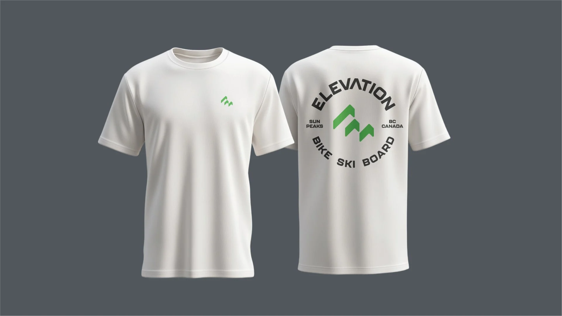
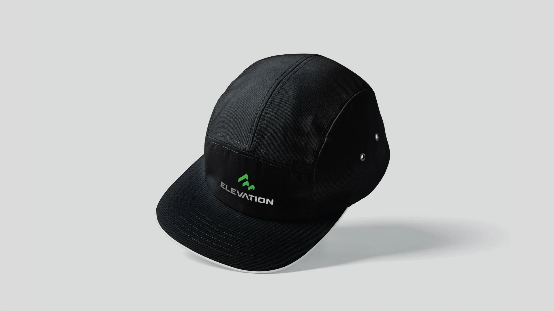
• Branded Merchandise & Applications
The Challenge
A Growing Business. An Outdated Identity.
Over the years, Elevation had expanded significantly, bringing multiple retail operations together and growing to approximately five times its original size. While the business had evolved, its branding had remained largely unchanged.
The existing identity was showing its age, with inconsistent signage and limited flexibility across the shop's different spaces and applications. Elevation needed more than an updated logo. It needed a cohesive visual identity that could bring everything together.
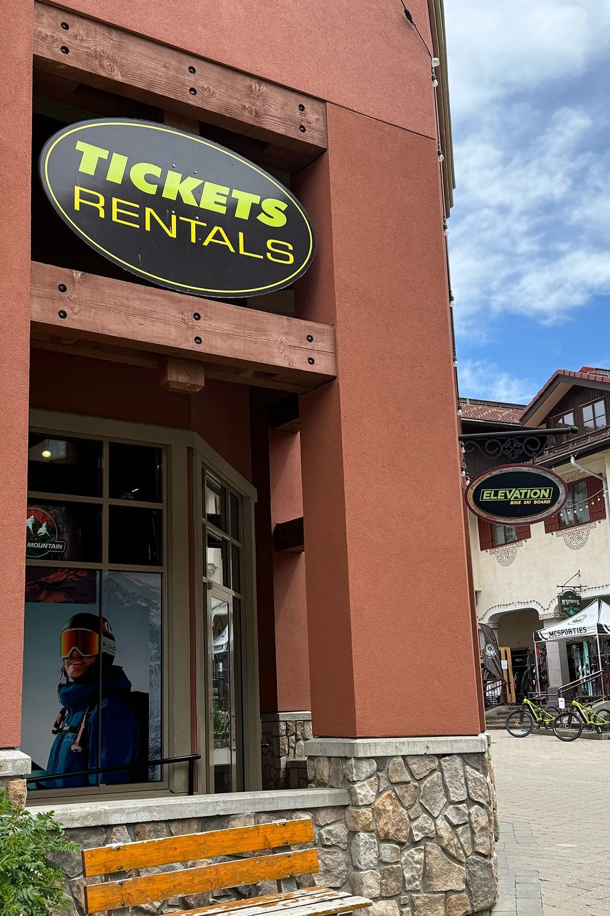
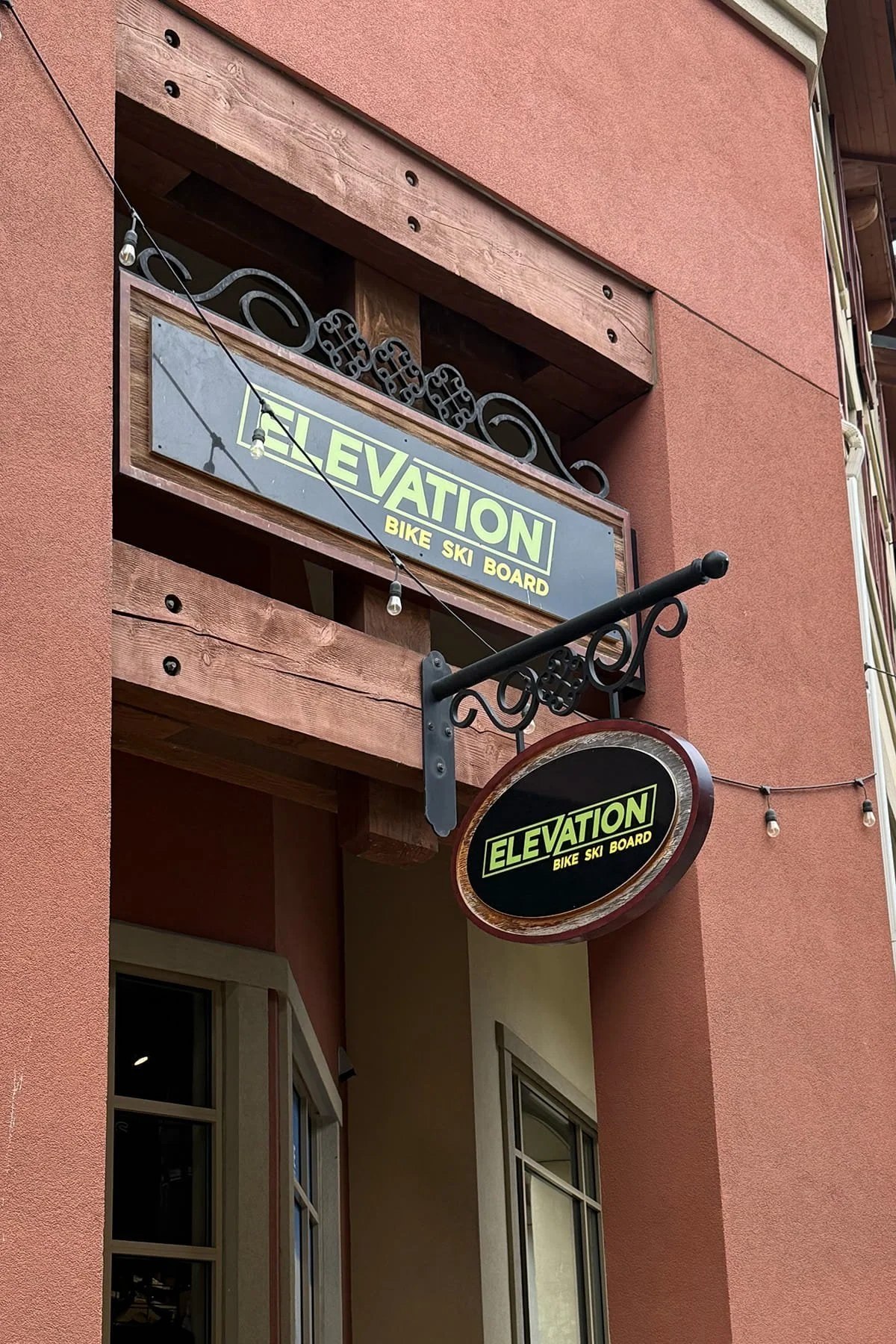
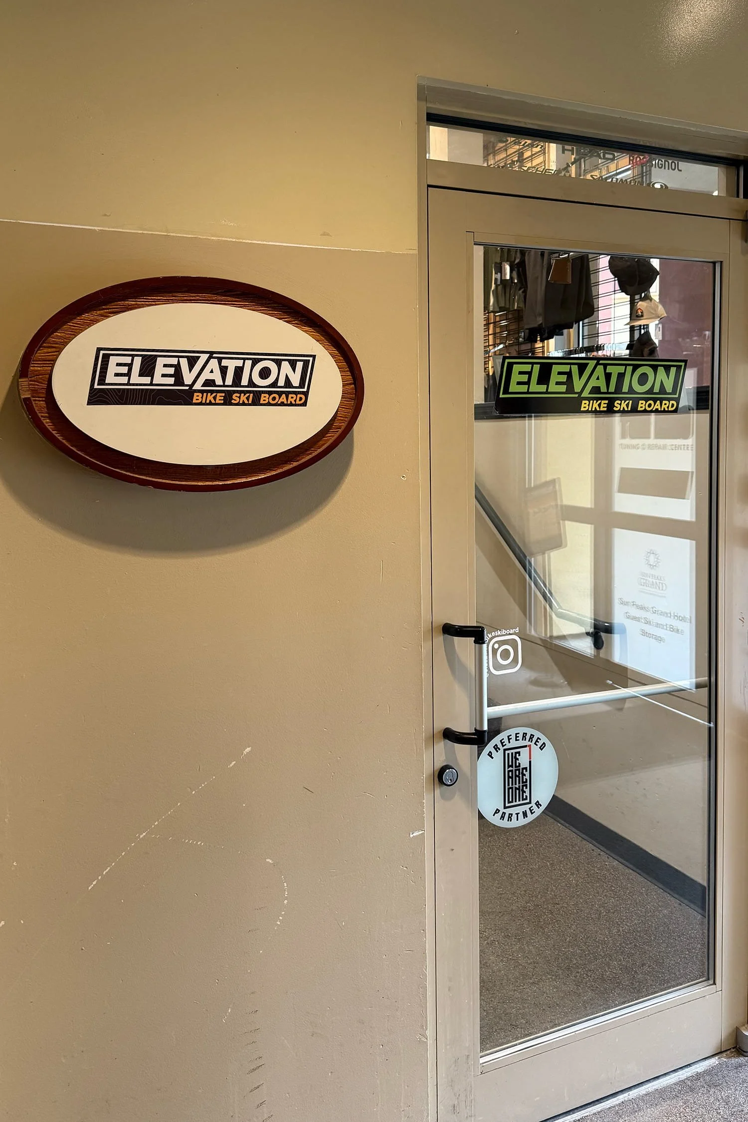
The challenge was to create something distinctly Elevation: bold, contemporary, and connected to mountain culture without relying on predictable outdoor imagery.
The new identity needed to appeal to experienced riders and first-time visitors alike, work across summer and winter, and establish a recognizable presence independent of the broader Sun Peaks Resort brand.
Creative Exploration
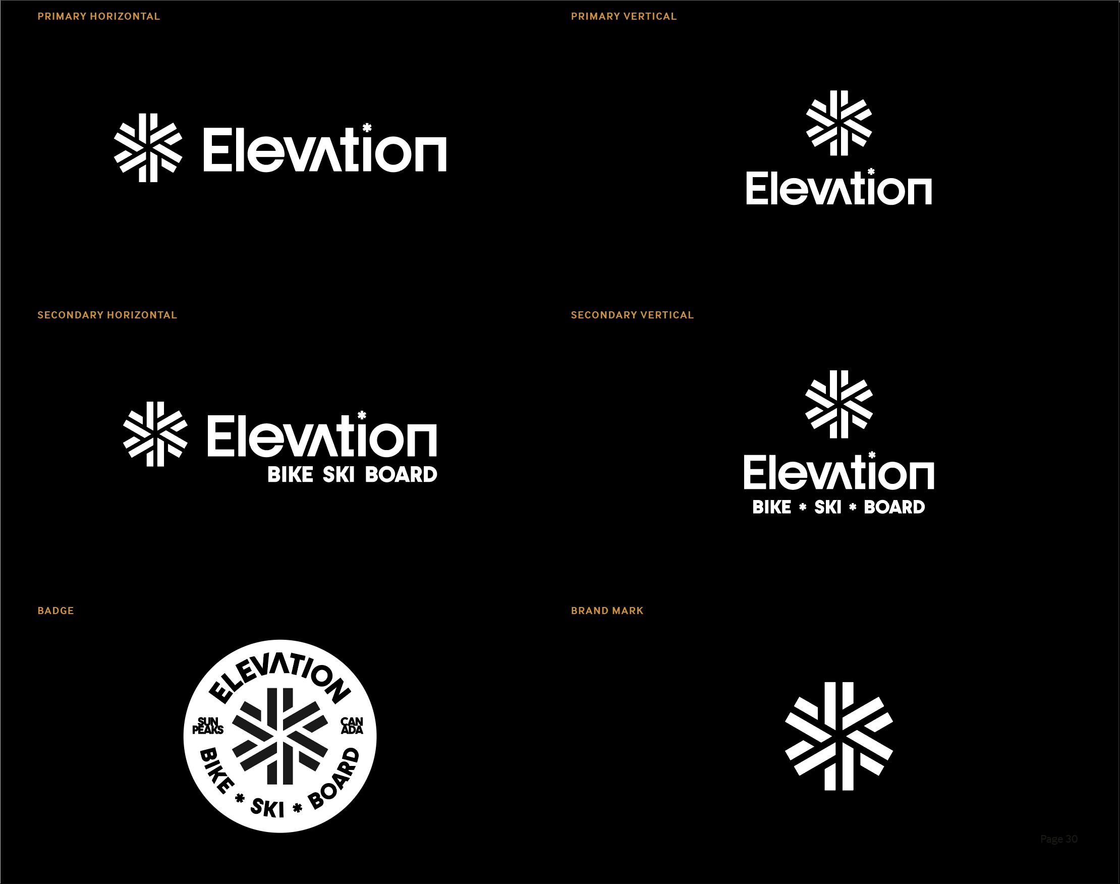
Concept 1
Concept 3
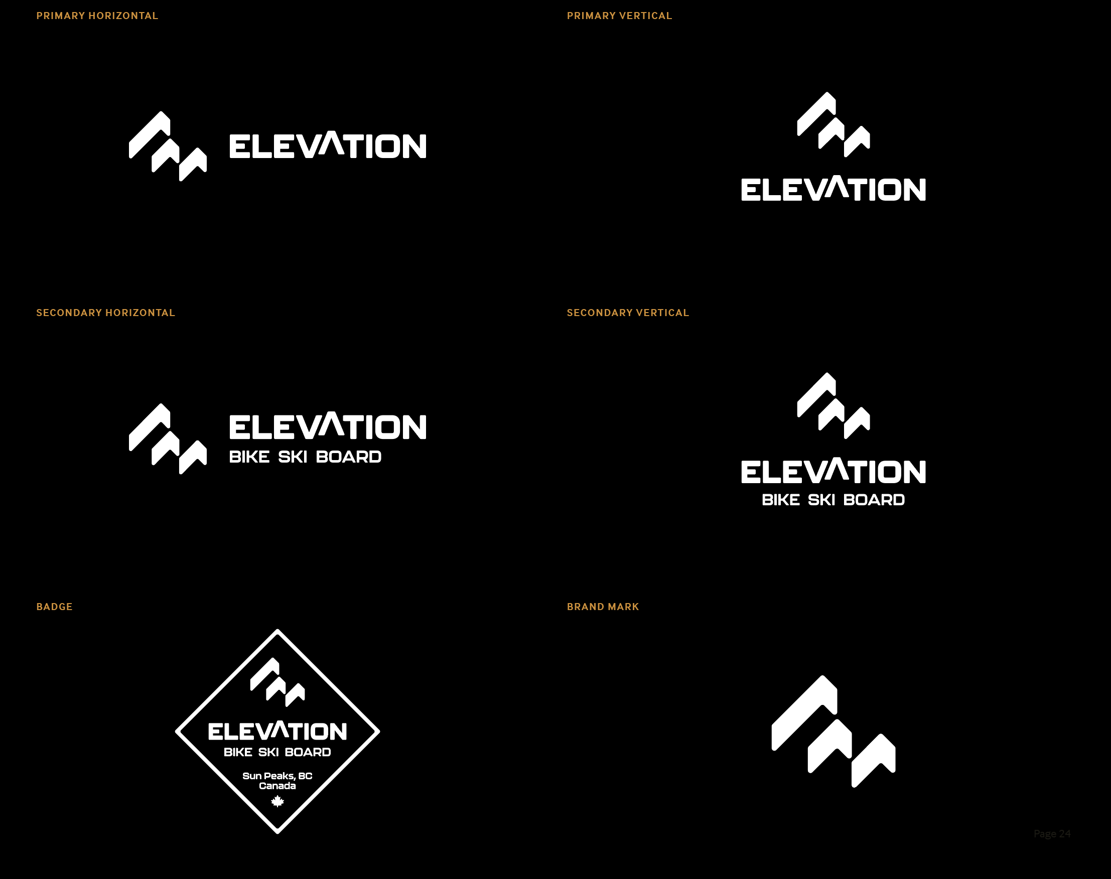
Concept 2
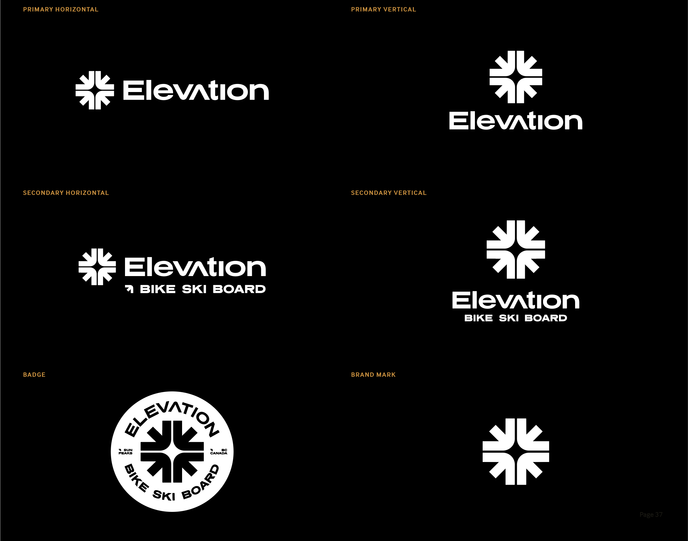
Concept 4
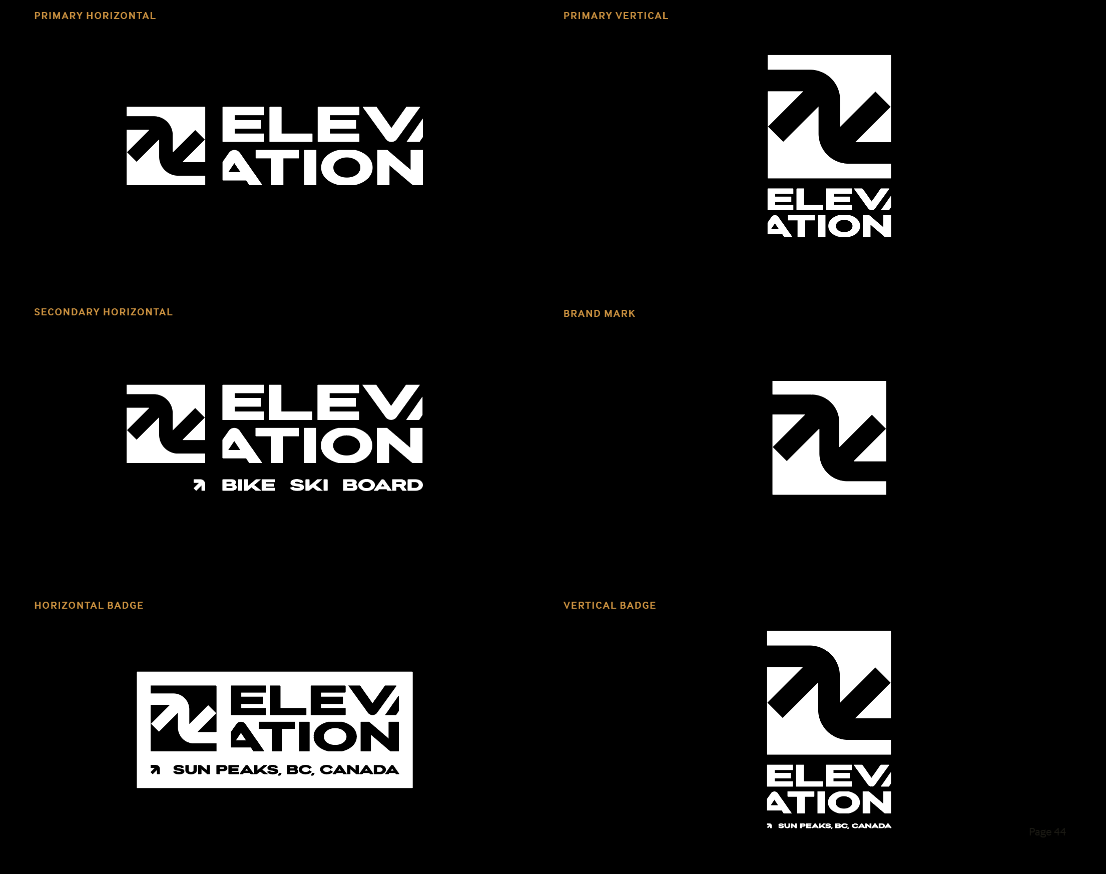
Concept 5
Five Concepts. One Big Challenge.
With the brand's challenges and goals established, it was time to explore what Elevation's new identity could become.
The project called for five distinct creative concepts, each offering a different interpretation of the brand. With less than two weeks to develop them, the challenge was to create five thoughtful directions that could each stand on their own.
The concepts explored different approaches to typography, symbolism, colour, and visual personality, creating a range of possibilities for the Elevation team to consider.
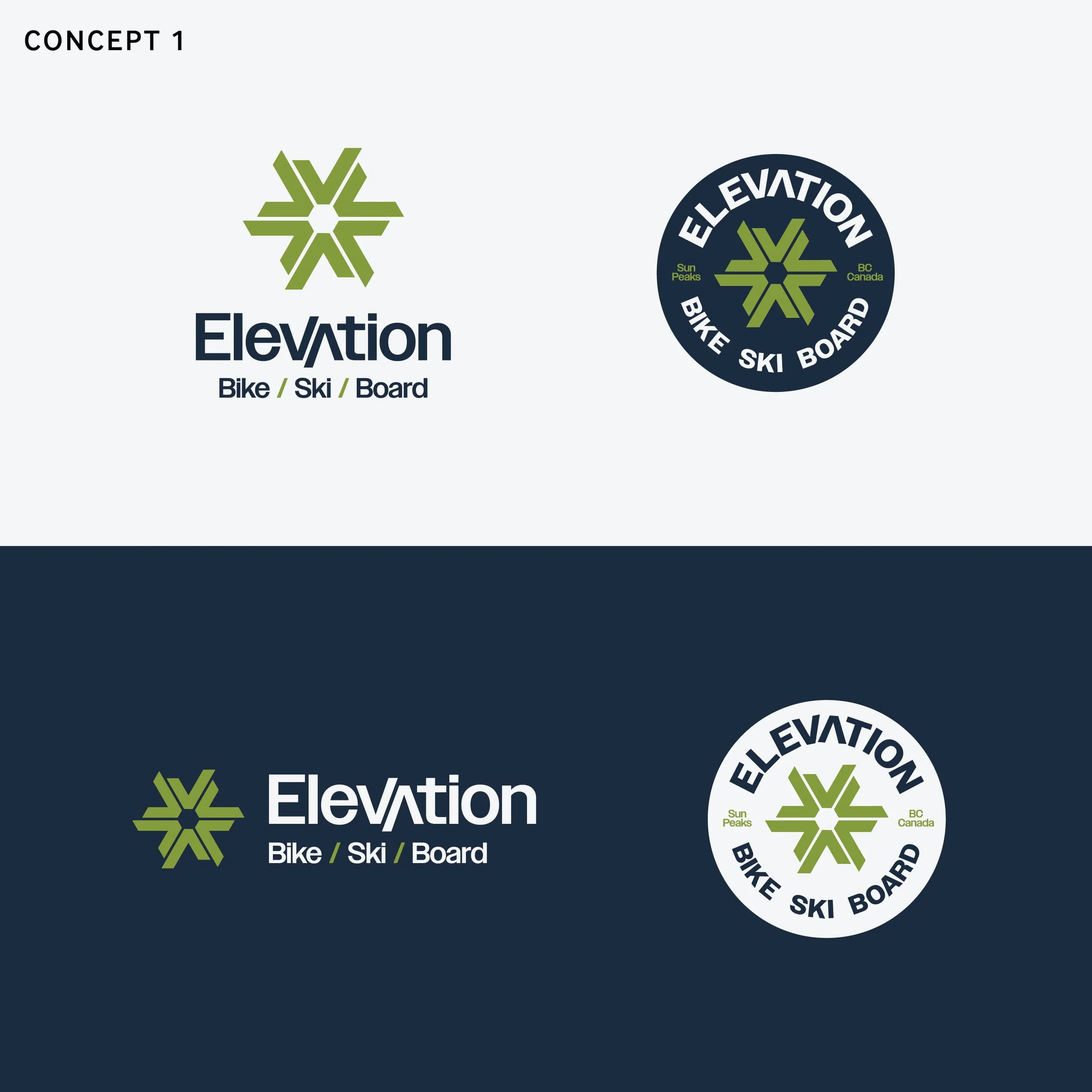
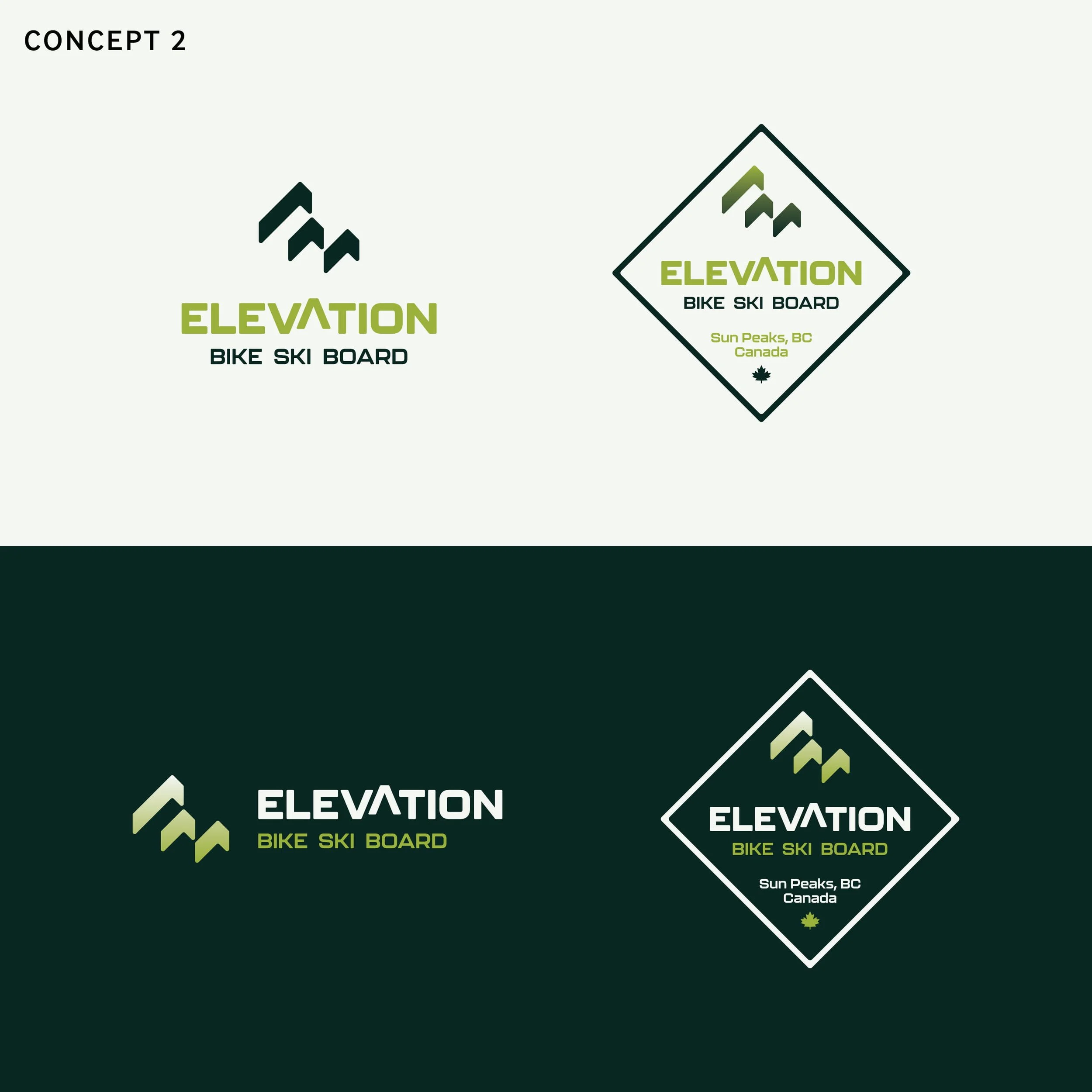
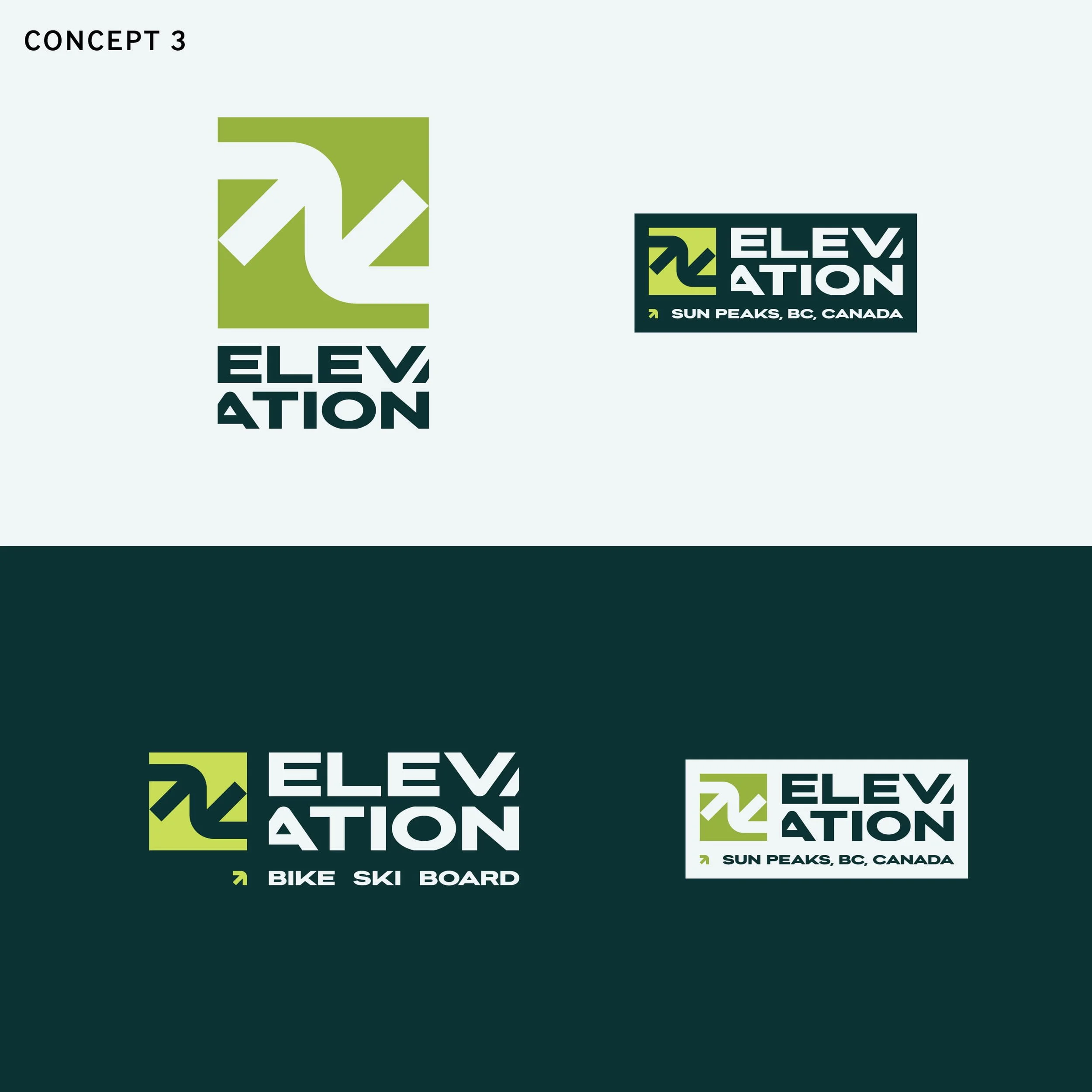
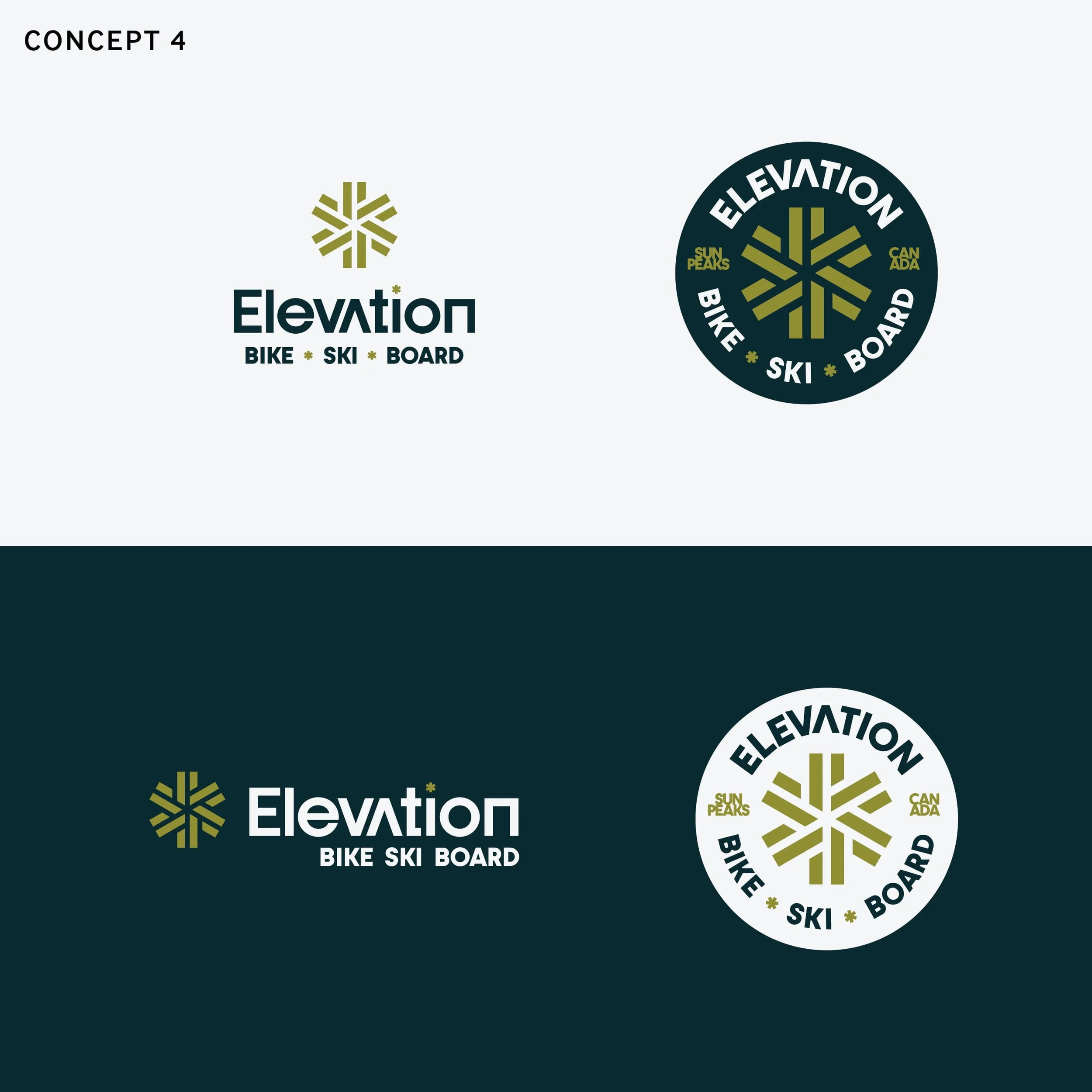
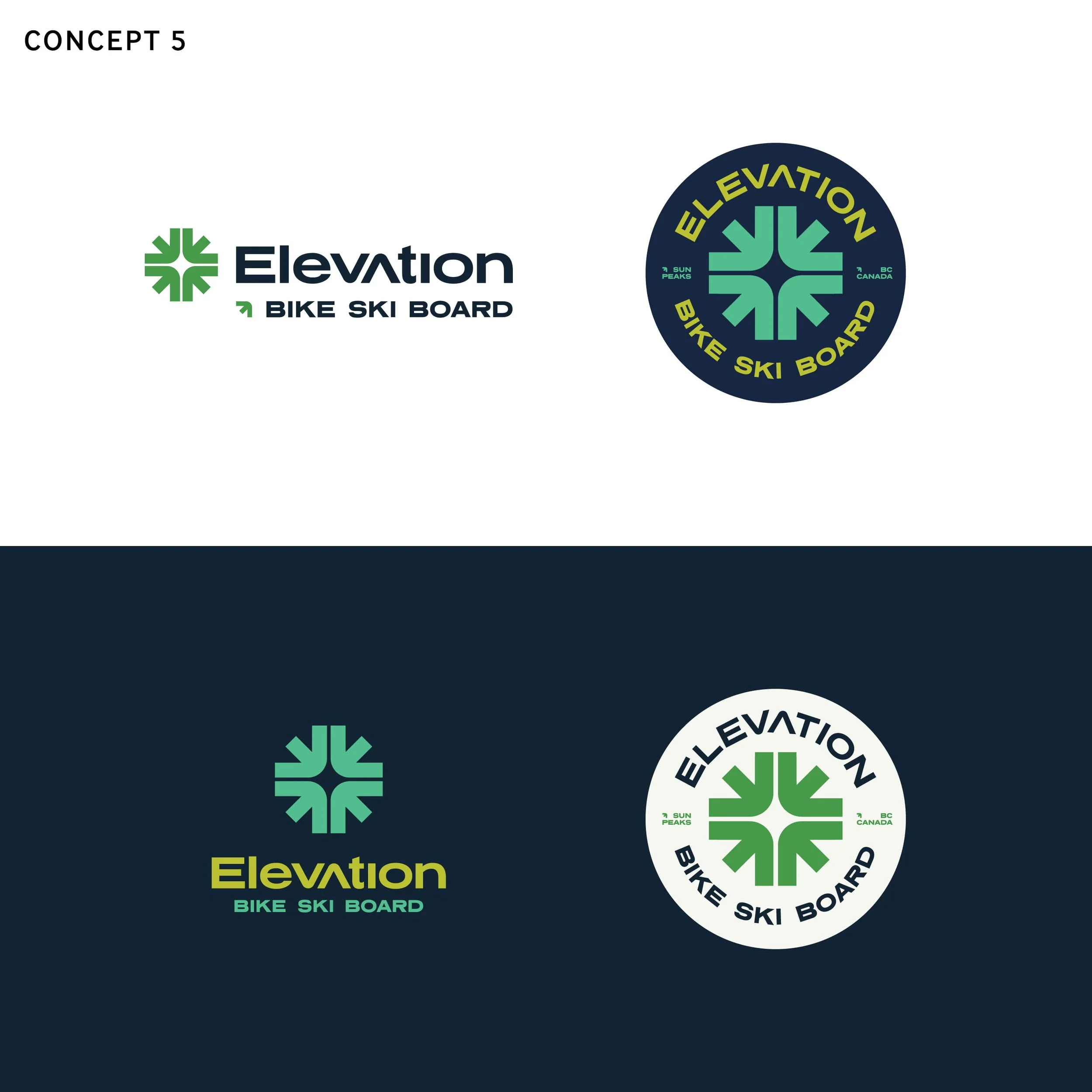
Five different possibilities, each with its own strengths. The next step was evaluating the concepts, gathering feedback, and identifying which direction offered the strongest foundation for Elevation's future.
Finding the Right Direction
Refining the Possibilities
The initial concepts were reviewed by the Sun Peaks retail and marketing teams, with feedback helping identify the strongest directions to explore further.
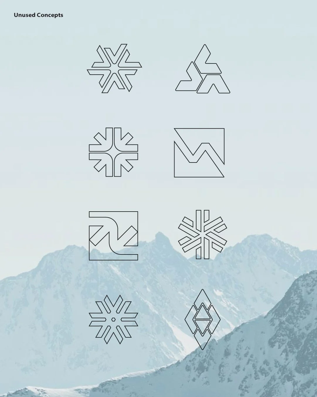
Through two rounds of revisions, the designs evolved with adjustments to typography, colour, logo structure, and supporting elements. Ideas were refined, combined, and reconsidered as the team worked toward a direction that felt right for the business.
This collaborative process helped narrow the possibilities and establish a clear path forward.
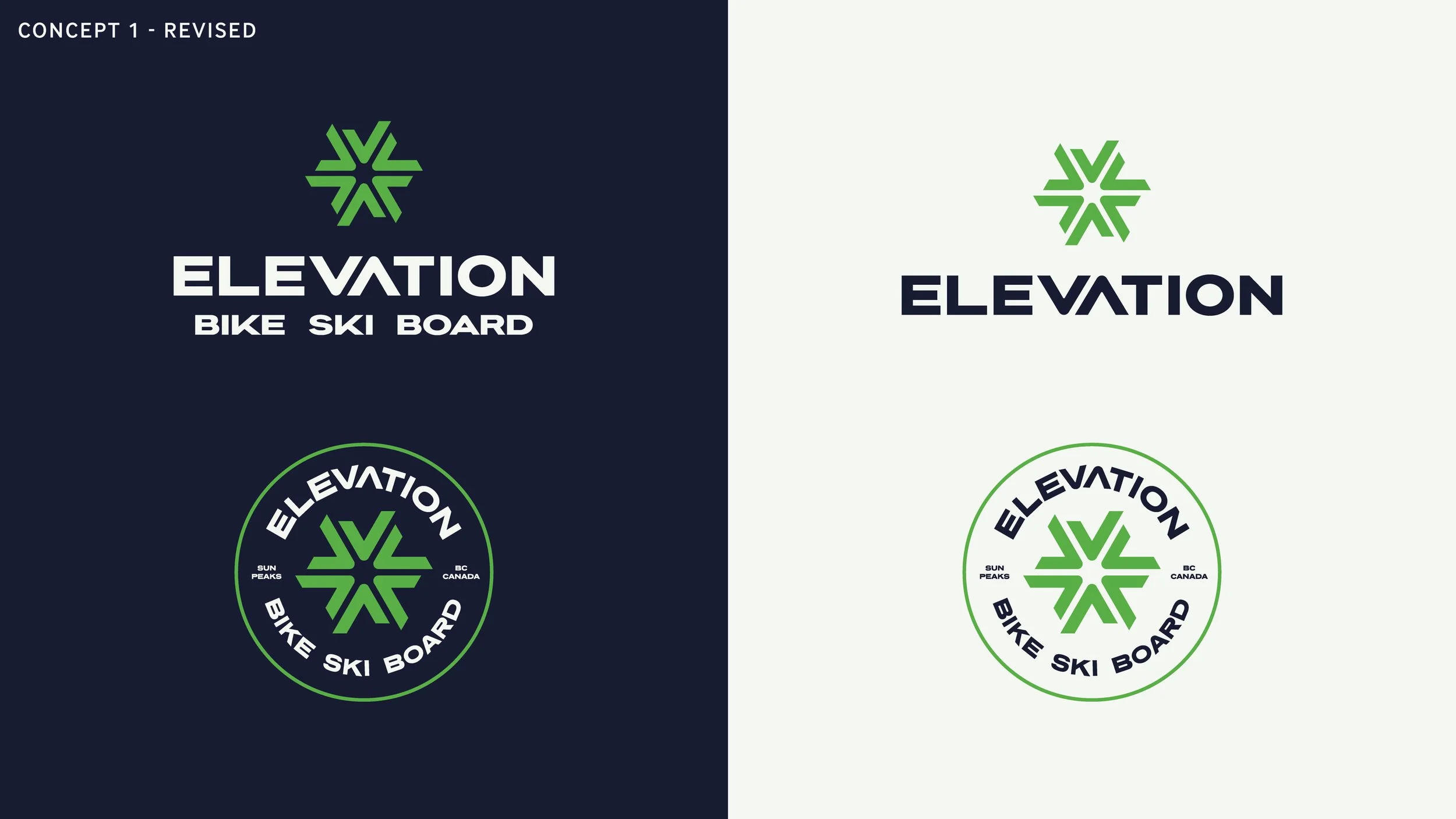
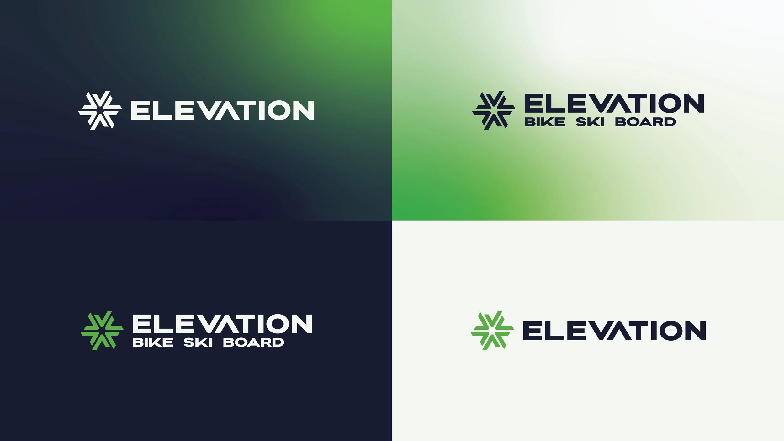
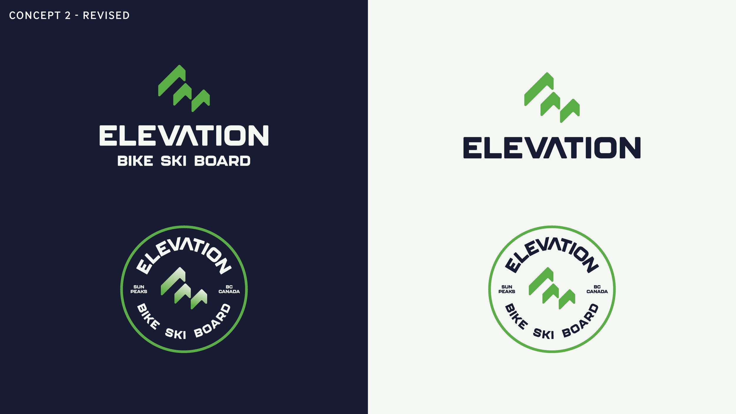
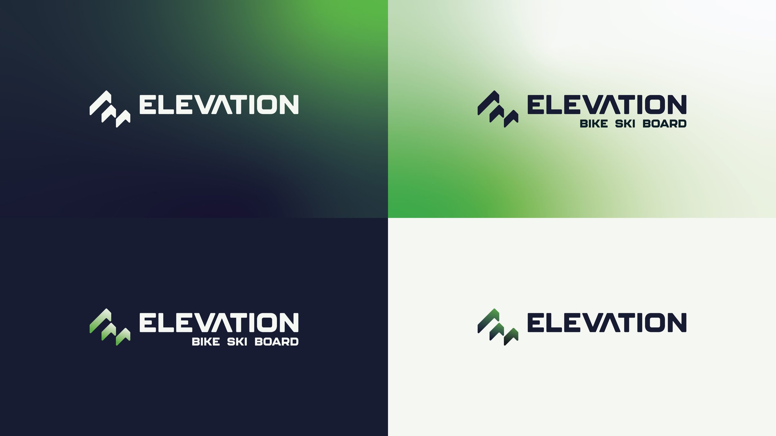
Concept 2 ultimately emerged as the favourite, earning strong support from both teams. Its distinctive geometric symbol, clean typography, and adaptable logo system offered the strongest foundation for the new identity.
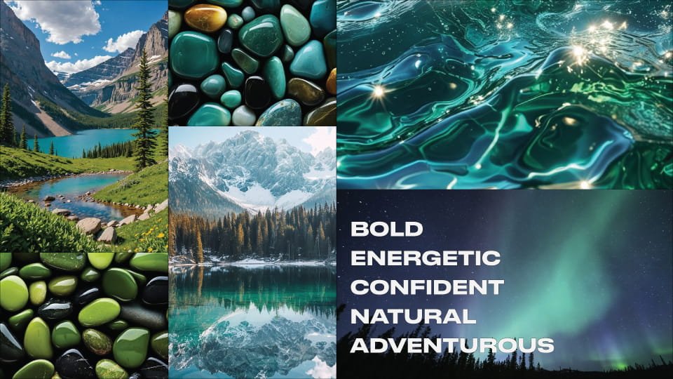
Further refinements led to the final design, paired with the Glacier colour palette.
The Final Identity
Built for Life on the Mountain
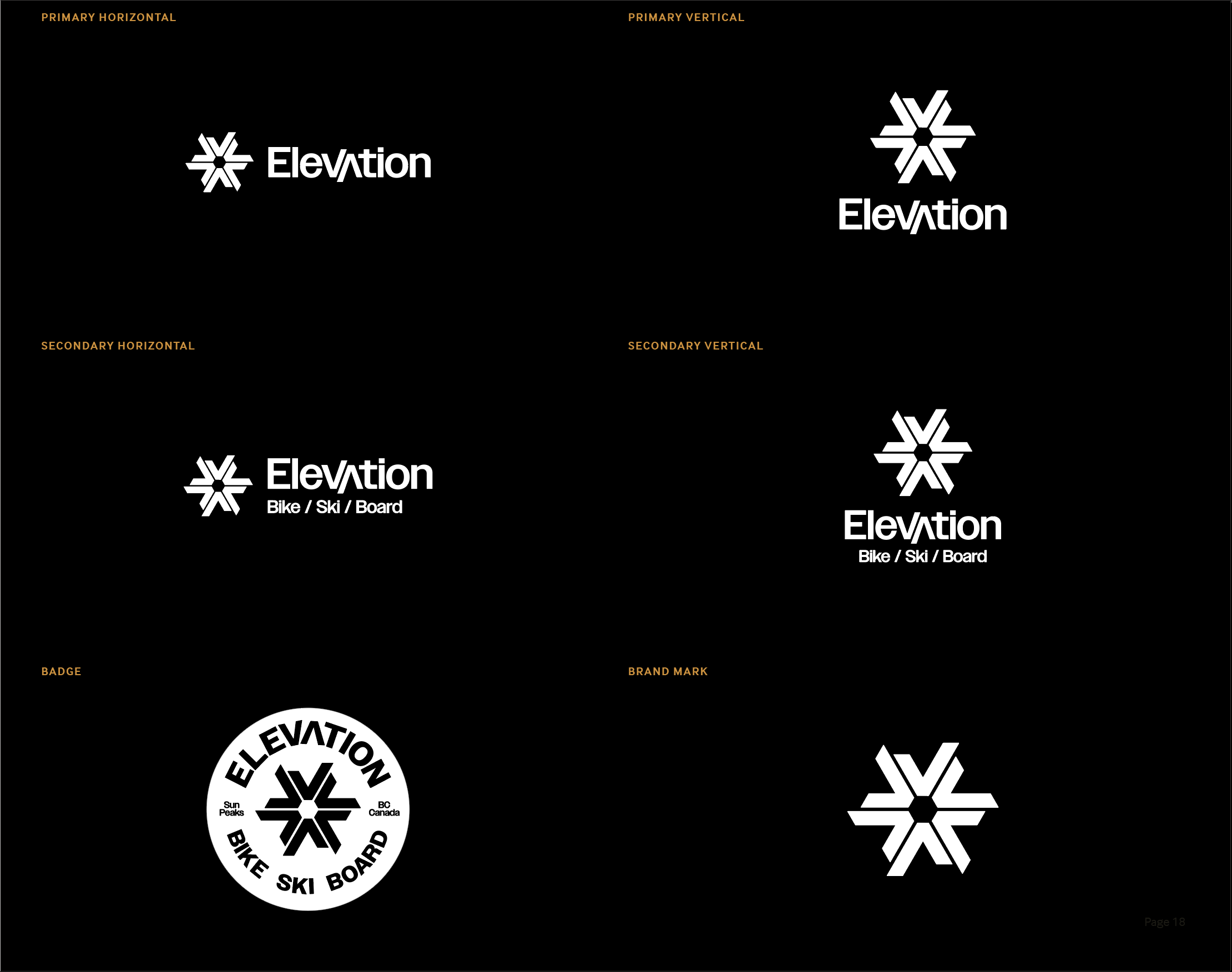
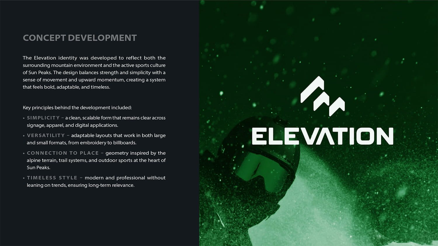
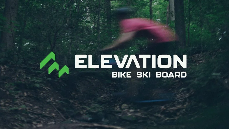
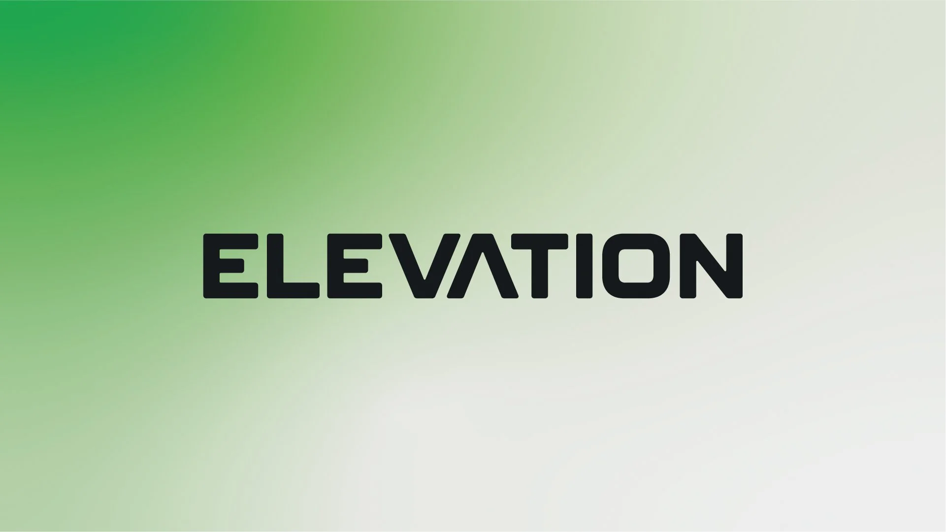
The final identity combines confident typography, a distinctive geometric symbol, and the Glacier colour palette to create a bold new look for Elevation.
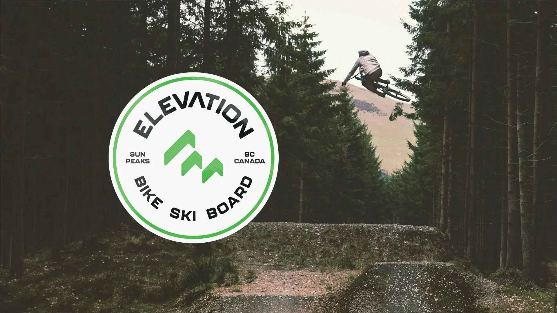
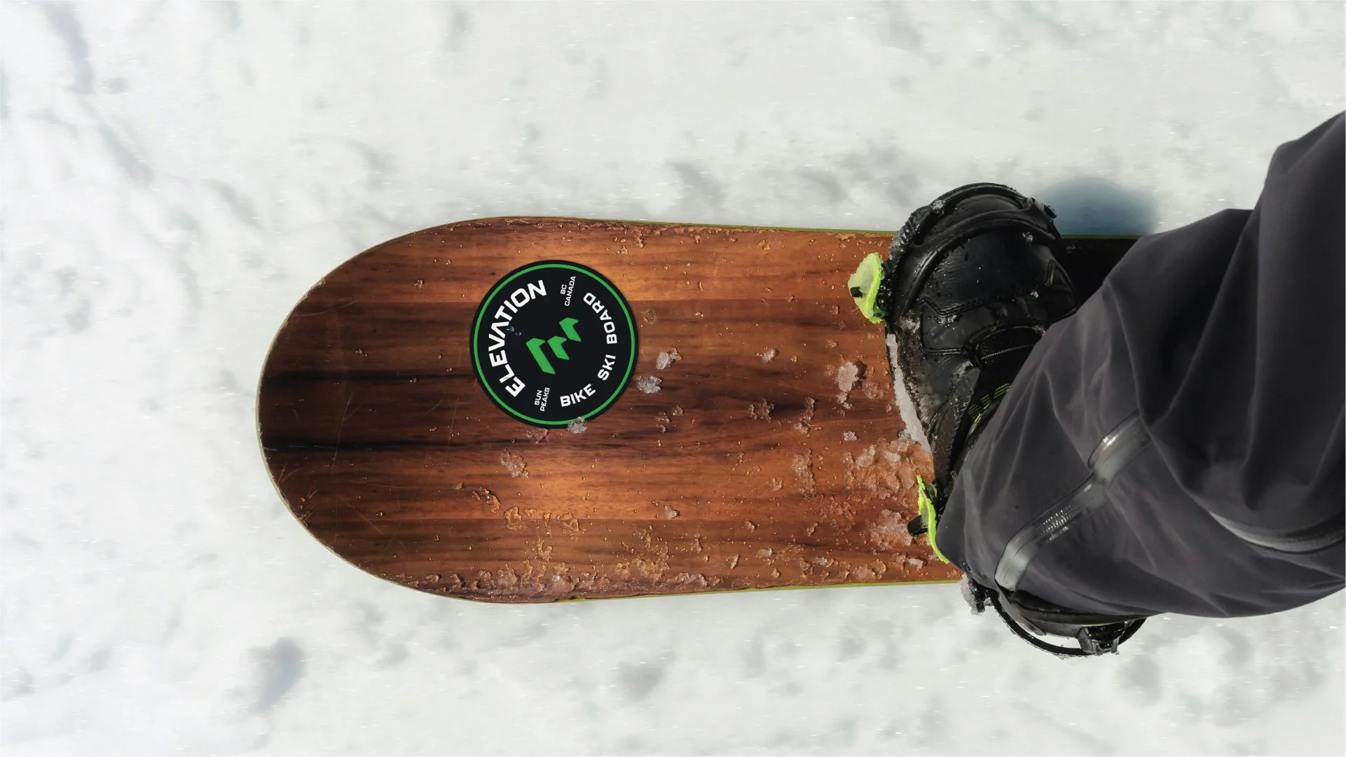
Inspired by the energy and movement of mountain sports, the visual system balances a contemporary aesthetic with a connection to the natural environment. The result is an identity that feels equally at home in a ski shop, on a mountain bike trail, or across the resort village.
The Story Behind the Symbol
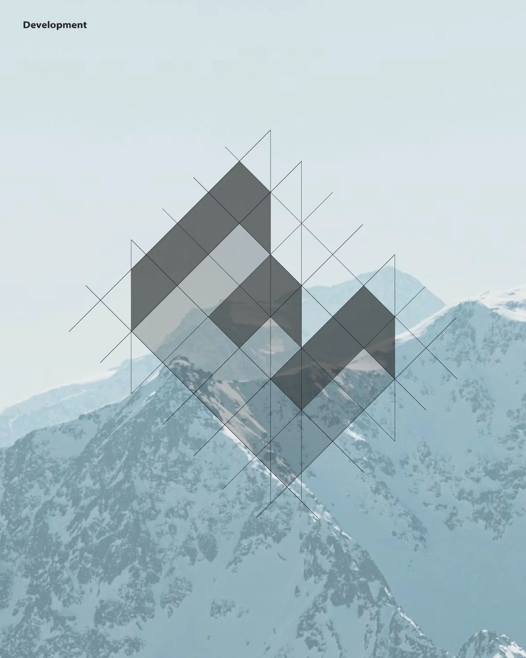
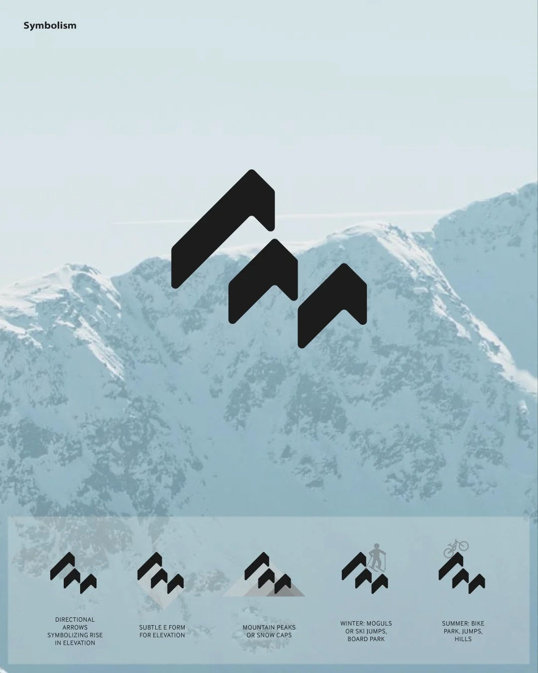
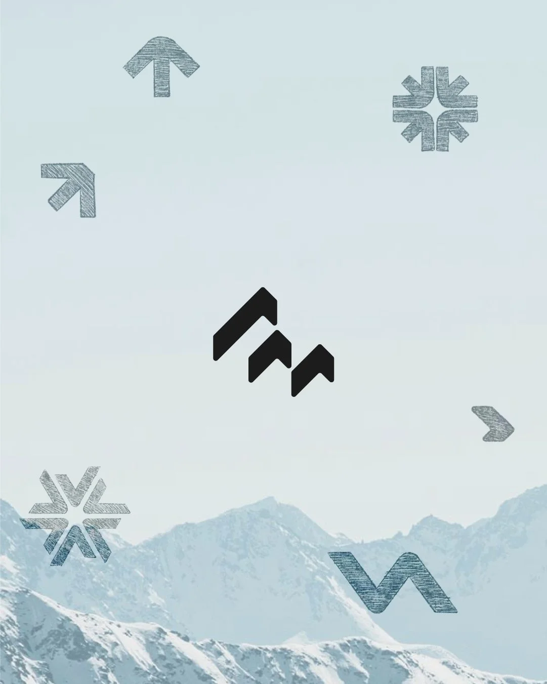
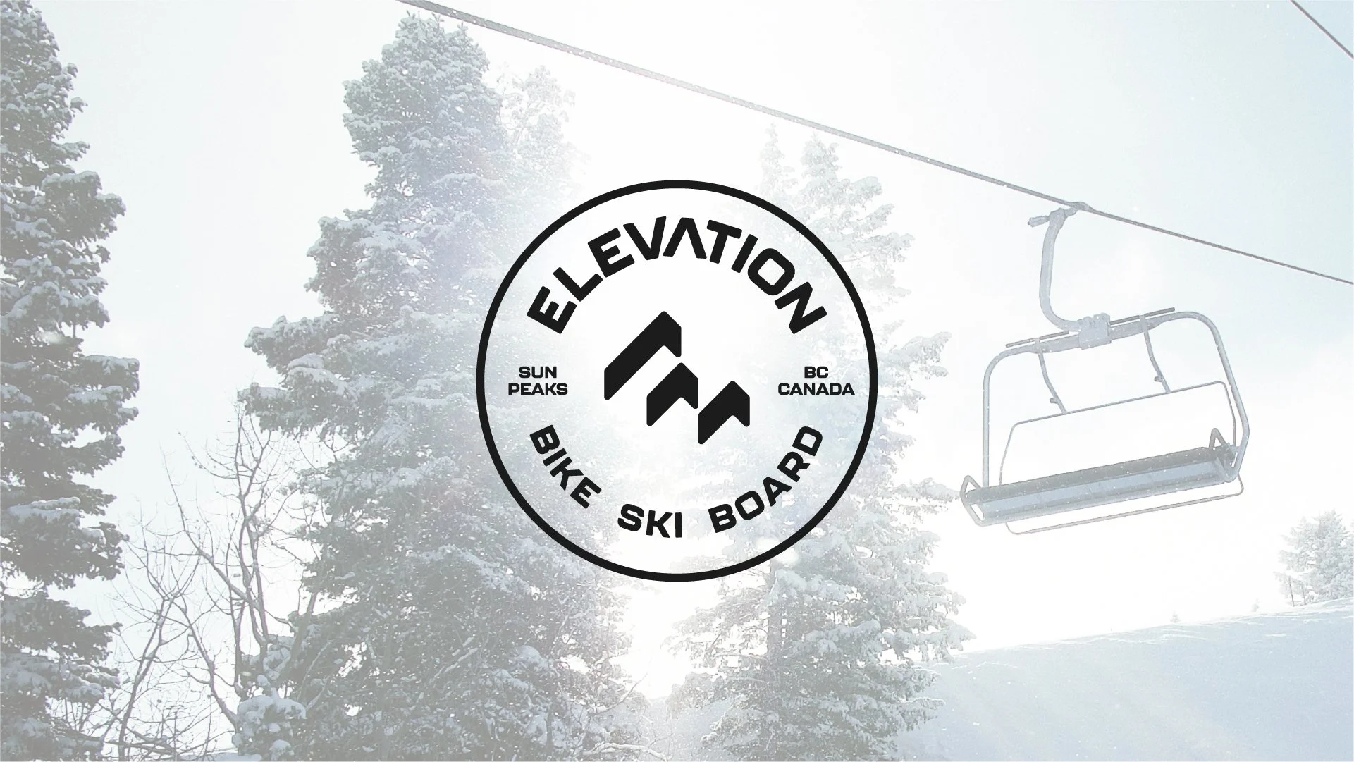
At the centre of the identity is a custom geometric symbol that brings several ideas together. Its angular forms create an abstract letter E while suggesting upward movement, changes in elevation, and the varied terrain experienced by skiers, snowboarders, and mountain bikers.
The simplicity of the mark allows it to stand confidently on its own, while its underlying meaning creates a connection to the Elevation name and the activities that define the business.
Bringing the Brand to Life
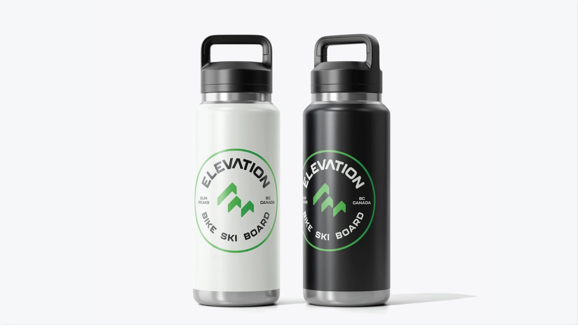
The finished identity was designed as a complete visual system, with a flexible suite of logos, supporting graphics, and brand elements that could adapt to Elevation's many applications.
From merchandise and apparel to storefront signage and everyday retail materials, the new branding creates a consistent presence while allowing each application to have its own character.
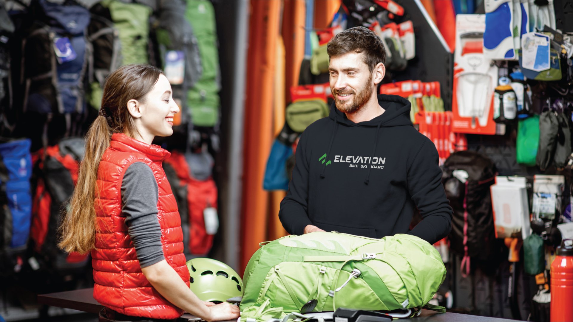
From Concept to Reality
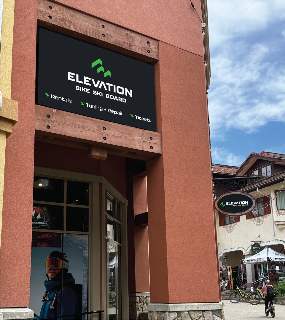
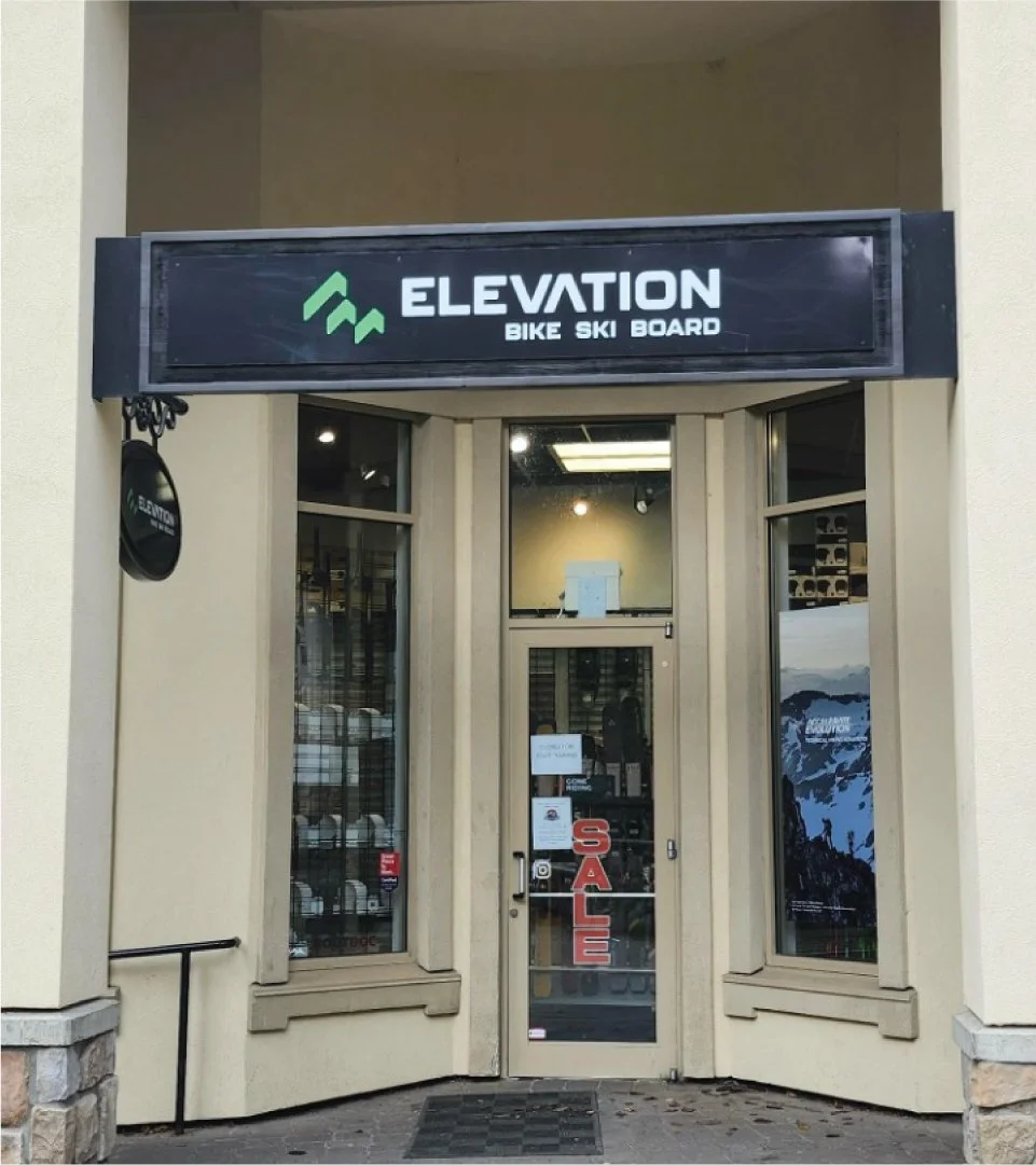
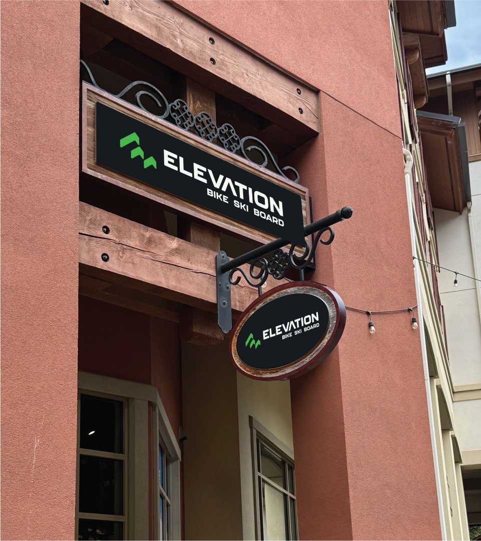
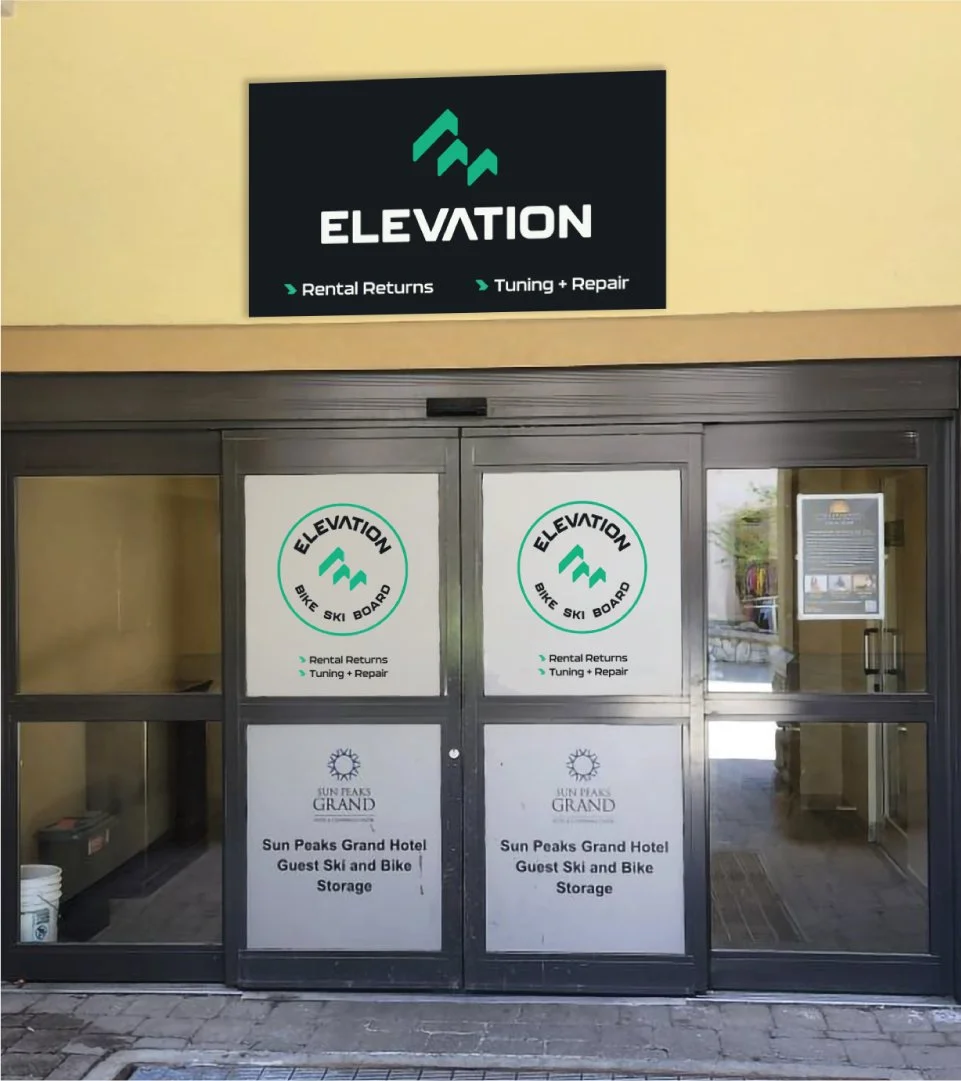
What began as five distinct creative directions became a complete new identity for Elevation, now taking shape across its retail spaces at Sun Peaks.
The updated signage brings a consistent visual presence to the village, connecting the different storefronts and services under one recognizable brand.